By Colette Hochstein (NLM)On October 12th, 2017, the National Library of Medicine Disaster Information Management Research Center (DIMRC) collaborated with Community Health Maps (CHM) to host a webinar focused on using mapping tools during disasters. The meeting was attended by 128 professionals, including first responders and receivers, emergency planners, and public health librarians, many of whom are involved, directly and indirectly, with disaster relief efforts.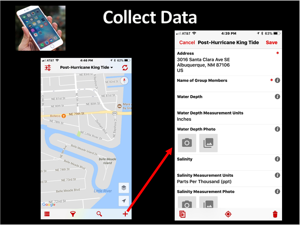 DIMRC provides access to health information resources and technology for disaster preparedness, response, and recovery; CHM provides users with information and training on low-cost mapping tools that can be used to collect data related to health hazards in communities, including during disasters. Many community-based organizations can better serve their constituents when they are able to collect and maintain their own data; CHM seeks to provide them with the training and tools needed to carry out cost effective and scalable mapping.After the basic premise of CHM was explained to webinar attendees, several case studies illustrating the different applications of CHM were detailed. One took place in Seattle, Washington and centered on mapping noise pollution in different neighborhoods. The primary focus of this case study was to provide useful insight into the public health concern of noise pollution, which has been linked to various health conditions. Other goals included offering recommendations on the scalability of the Urban Indian Health Organization (UIHO) network and measuring and testing the usability of the CHM GPS/GIS workflow.Another study described how CHM was used to map “King Tides” in Miami, Florida, and was CHM’s first opportunity to work in the field with users of its workflow. The goal was to communicate health risks associated with the 2017 King Tides during their highest activity, and to demonstrate how the flooding affects local communities. It was also a good test case of successfully using the tools in challenging field conditions.Overall, the webinar provided the audience with information on the resources offered by CHM and demonstrated how different populations and communities, such as communities affected by disasters, can use CHM to collect and interpret their own data. You can watch the webinar by clicking on this link.
A New Version of QGIS v2.14 Has Been Released!
Currently a new version of QGIS is released every four months! To help users deal with this rapid development pace, the version put out each spring is designated as a long-term release (LTR). This means it will be supported for one calendar year. After that, new stable versions continue to be posted quarterly and any bug fixes associated with those quarterly versions are applied to the LTR. The LTR is recommended for production environments. It has a slower release cycle, and receives regular bug fixes throughout the year. Monday February 29th QGIS 2.14, the next LTR was released. It is nicknamed 'Essen' after the town in Germany where a recent developer meeting was held. Essen has a lot of new features. You can visit the Visual Changelog to read about all the new features in detail. You can also see who developed and sponsored each new feature. Community Health Mappers might be especially interested in these new features:
- the new 2.5 D renderer which allows you to extrude features into space.
- improved labeling
- better control over map elements in the Print Composer
- an improved Processing Toolbox
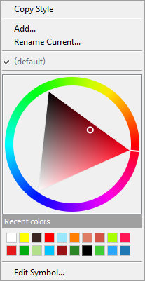
- the new widget you get by right clicking on a layer in the Layers Panel and choosing Style. It allows you to change the color for a symbol without having to open a single dialog box!
 If you are using QGIS you should visit the download page and install the latest version! Note that the Mac installer takes a little longer to assemble and may not be available for several more days.Happy GIS'ing!
Using CartoDB for Beautiful Online Maps
CartoDB is an online cloud based platform for storing and visualizing spatial data. It is the perfect tool for the third part of the workflow (outlined in the Introduction). You can sign up for a free account, which gives you 50Mb of storage space. Data can be collected with a smart phone or tablet with iForm, and brought directly into CartoDB. It is a very intuitive platform. You can literally drag and drop a spreadsheet onto the CartoDB page and have the data upload to your account. It will accept the most common geospatial file formats including: spreadsheets and comma delimited text files with addresses or coordinates, KML/KMZ, GPX, and shapefiles. Below is an example of a spreadsheet of Baltimore Dialysis Centers in CartoDB. This shows the spreadsheet in Data View .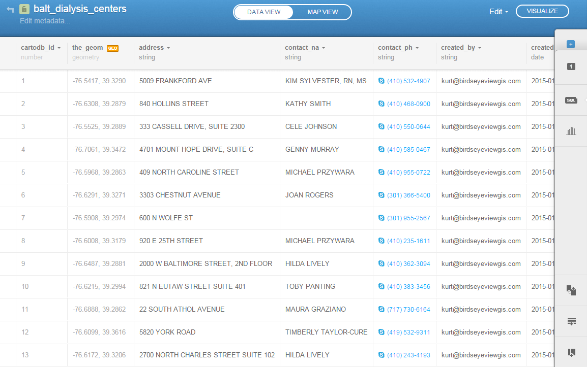 After telling CartoDB which columns contain the latitude and longitude values, the data can be viewed in Map View (below). Here the default Positron basemap is being used. There are a variety of basemaps to choose from including imagery, Stamen maps and Nokia maps.
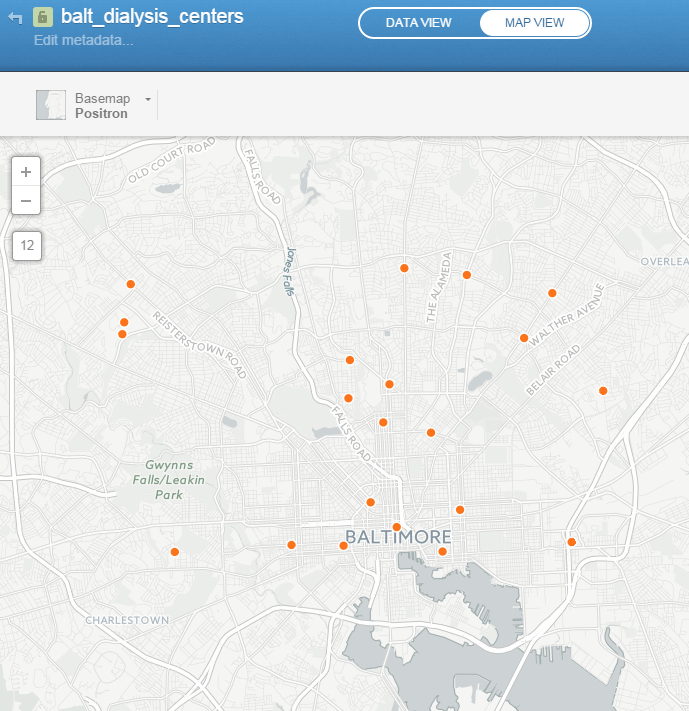 Once multiple data layers have been uploaded you can create a visualization. Below is a map focusing on Balitmore Diabetes. It includes Baltimore neighborhoods classified by the number of diabetics, food deserts and dialysis centers. CartoDB provides wizards and other tools for styling your data. The dynamic map can be accessed here: http://cdb.io/1G4xP7j
 Visualizations can be shared via hyperlinks and embedded into webpages. CartoDB also has great documentation including:
- CartoDB Editor Documentation
- A comprehensive series of tutorials breaking tasks up into Basic, Medium and Advanced categories
- Tips and Tricks
- FAQ’s
Sign up for a free account and take it for a spin. On a related note Community Health Maps is almost done with a complete curriculum for community health mapping. It consists of six labs. The final lab shows you how to work with CartoDB from setting up an account to sharing a visualization. Stay tuned!
Community Health Maps Survey
If you've followed this blog, you know that the goal of the Community Health Maps initiative is to help community organizations identify and apply low-cost and easy-to-use online mapping tools (GIS). If you are a first time visitor to this site we encourage you to peruse the blog entries.The purpose of these tools is to improve understanding and visualization of health conditions in the community so that attention might be best directed to reduce health disparities. This site is a collaborative effort between the National Library of Medicine, the Center for Public Service Communications, and Bird’s Eye View.To help advance this mission we have developed a survey. The goal of this survey is to assess community health organizations’ satisfaction with GIS / mapping resources currently available to them. The information will be used to improve NLM’s Community Health Maps site and tailor it to specific user requirements.You are encouraged to click the link below and take this brief survey.https://www.surveymonkey.com/s/NLM_GIS

