Carto, the platform for making online maps, recently abandoned it's free license option. The reason they gave was that many users were creating accounts, sometimes several accounts, and simply not using them. This became expensive overhead for them to manage. As a result they now offer a Professional or Enterprise plan once your free trial expires. This new pricing scheme is shown below: Note that non-profit organizations receive a 20% discount off this Professional license. This license also affords you many more benefits than the previous free license. For example, the free license gave you 50Mb of cloud storage space while the Professional plan gives you 500Mb. It also allows you to set permissions on your datasets to make them private. It also gives you email and online support.If that price is beyond your organizations budget you will notice that directly below the pricing plan is a section covering FREE Plans for Students and Great Causes!
 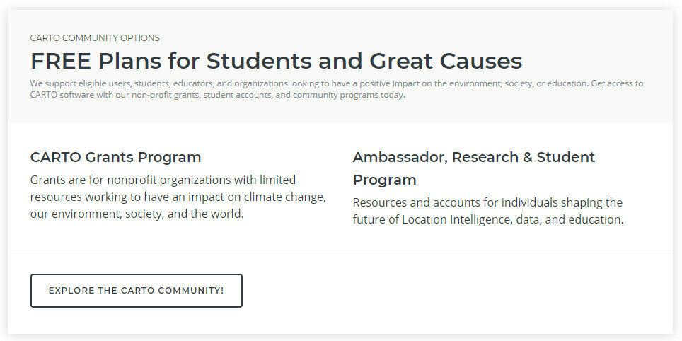 Carto has a grant program. You can read about this program here. All it takes to apply is filling out an application form!
CartoDB Rebranded as Carto
Community Health Maps has long recommended the use of CartoDB for those interested in low cost online mapping and data visualization. In fact, CHM caught the beginning of this wave because CartoDB wasn't even launched until 2012! Early last month (July 2016) CartoDB was rebranded as Carto, which includes a new logo. However, once you get beyond the new logo your current account page including your data and maps remains unchanged. You can still build maps the way you always have in what is now known as Carto Editor.
 The main difference is that Carto now offers up a new interface named Carto Builder. The good news for Community Health Mappers is that their goal with Carto Builder is to introduce an updated interface. One that still does not require complex geospatial skills and programming. With Carto Builder they aim to make Location Intelligence (LI) more accessible to more people. This means it will give you point and click access to deeper analysis of your data. Builder will have all the functionality currently found in Editor along with the new tools.Eventually Carto Editor will be phased out and Carto Builder will be the interface everyone uses. You can request early access to Carto Builder here: http://go.carto.com/request-beta-access. New users of Carto will be given access the the Carto Builder in phases, over the next several months. All existing maps and data will be seamlessly migrated to the new interface. The following page answers Frequently Asked Questions about the migration from Editor to Builder: https://carto.com/docs/carto-builder/faqs/Once the migration is complete I will post about the new functionality. Stay tuned!
Tableau Public for Data Visualizations
Tableau Public is free software that can help users publish interactive data visualizations to the internet. This software is another great option for data visualization along with GIS Cloud or CartoDB. It has powerful charting and graphing tools, and also allows you to map data and display that data against several online datasets and basemaps.No plug-ins or programming skills are required, just a browser with JavaScript enabled. Tableau Public uses a simple drag and drop process that anyone can learn. You can work with either the free Tableau Desktop app, or Tableau Online the free cloud based server. Either way you can save your work to the Tableau Public Web servers, which are accessible by everyone on the Internet. One important note about this is that any data you publish is accessible to everyone on the internet.People see and understand data, reports and dashboards faster with visual analytics technology, which can help uncover key trends, relationships, patterns, and outliers that might otherwise be a challenge to find. Tableau Public can be used to pare down information to its simplest form by stripping away the less important data.The software can connect to Microsoft Excel, Microsoft Access, and multiple text file formats. It has a limit of 1,000,000 rows of data allowed in any single file. Your organization may use up to 50 megabytes of space.Tableau Public projects can be shared by emailing a link or by embedding the work in a blog, wiki, or website. Clicking on an emailed link will open a browser page with the view loaded. If embedded onto a page, anyone who visits the page will see the live interactive view. The following shows the use of Tableau Public in two health related studies.Public Health Case StudiesTo visualize the specific social problem of teen pregnancy over time, Tableau Public was used by the Wisconsin Council on Children and Families to show the decline in births to teen mothers in Wisconsin over recent years. The data depicts racial disparities in teen births in Wisconsin as well as differences in birth rates between older and younger teens. The online link to the data visualizations created with Tableau Public for this study can be found here: http://tblsft.com/public/gallery/teen-pregnancy-declinesThe figure below is a screenshot of one of the data visualizations from this study. Data visualizations are interactive. Here the white popup window is showing data from a specific place on the line graph. Such visualizations may help communities address and manage such issues as health problems associated with prematurity and poor academic performance of children of teen parents.Data can also be mapped by geographic coordinates, city, state, county, and zip code. The visualization below deals with Medicare Costs and combines a map with a chart showing trends in the data.
 Other data visualization examples created with Tableau Public can be found in the Gallery:http://www.tableausoftware.com/public/galleryOther Tableau Public Resources can be found here:https://public.tableau.com/s/resources
Using CartoDB for Beautiful Online Maps
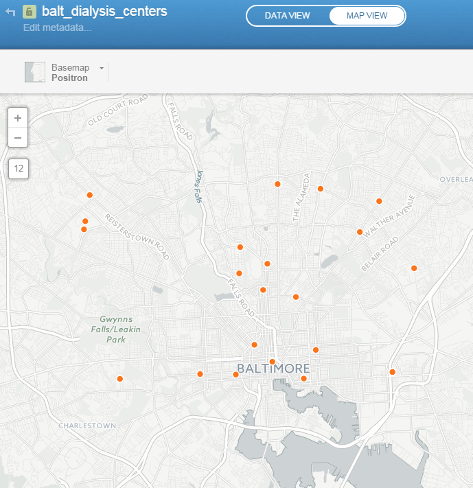
CartoDB is an online cloud based platform for storing and visualizing spatial data. It is the perfect tool for the third part of the workflow (outlined in the Introduction). You can sign up for a free account, which gives you 50Mb of storage space. Data can be collected with a smart phone or tablet with iForm, and brought directly into CartoDB. It is a very intuitive platform. You can literally drag and drop a spreadsheet onto the CartoDB page and have the data upload to your account. It will accept the most common geospatial file formats including: spreadsheets and comma delimited text files with addresses or coordinates, KML/KMZ, GPX, and shapefiles. Below is an example of a spreadsheet of Baltimore Dialysis Centers in CartoDB. This shows the spreadsheet in Data View .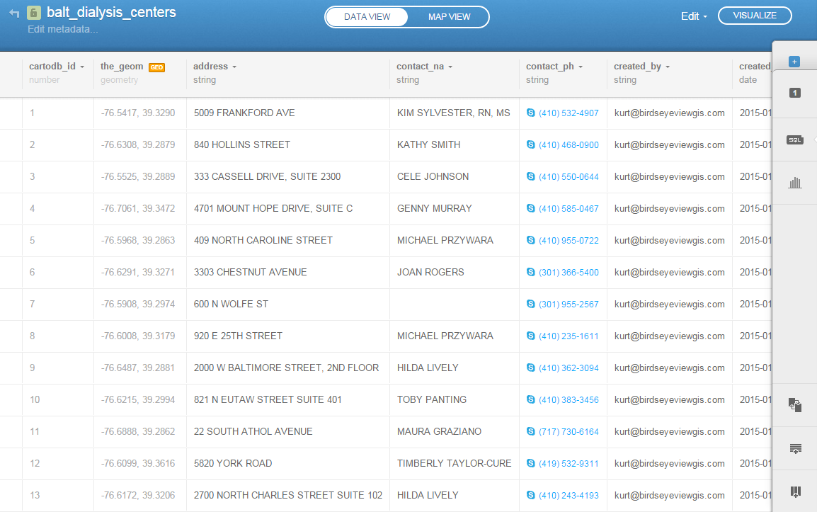 After telling CartoDB which columns contain the latitude and longitude values, the data can be viewed in Map View (below). Here the default Positron basemap is being used. There are a variety of basemaps to choose from including imagery, Stamen maps and Nokia maps.
 Once multiple data layers have been uploaded you can create a visualization. Below is a map focusing on Balitmore Diabetes. It includes Baltimore neighborhoods classified by the number of diabetics, food deserts and dialysis centers. CartoDB provides wizards and other tools for styling your data. The dynamic map can be accessed here: http://cdb.io/1G4xP7j
 Visualizations can be shared via hyperlinks and embedded into webpages. CartoDB also has great documentation including:
- CartoDB Editor Documentation
- A comprehensive series of tutorials breaking tasks up into Basic, Medium and Advanced categories
- Tips and Tricks
- FAQ’s
Sign up for a free account and take it for a spin. On a related note Community Health Maps is almost done with a complete curriculum for community health mapping. It consists of six labs. The final lab shows you how to work with CartoDB from setting up an account to sharing a visualization. Stay tuned!
Display and Share Your Maps Online via GIS Cloud
The third step in the workflow (outlined in the Introduction) is to share your maps online via GIS Cloud. This is an online mapping platform. You can sign up for a free account, upload your data, and share your maps with others. The maps will be dynamic, meaning you can do things like pan and zoom, turn layers on and off and identify features.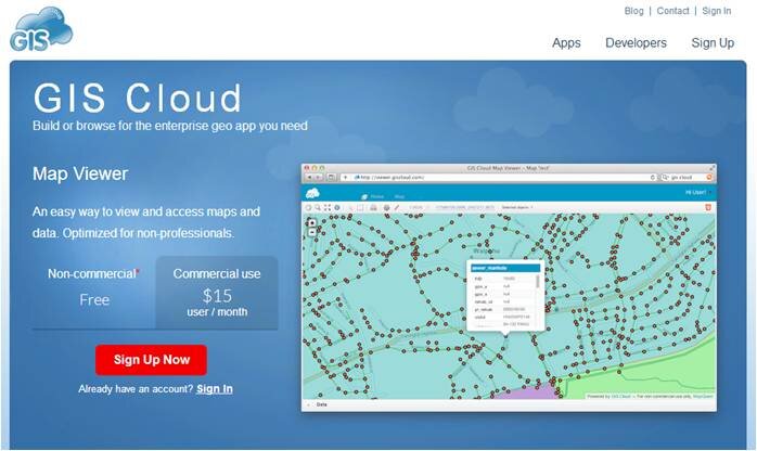 PricingYour free account comes with a Map Viewer and Map Editor and gives you 100Mb of space in your cloud account. If you require more space you can upgrade to Premium subscription which offers 1 Gb of space. Premium accounts cost $55/month.Data UploadGIS Cloud accepts all common GIS file formats and the data upload section is very intuitive. You can zip all your data and just upload the zip file and GIS Cloud will take care of the rest. You can even drag and drop files anywhere in the browser and they will upload to your account. Once uploaded it offers a nice range of options for symbolizing your data.
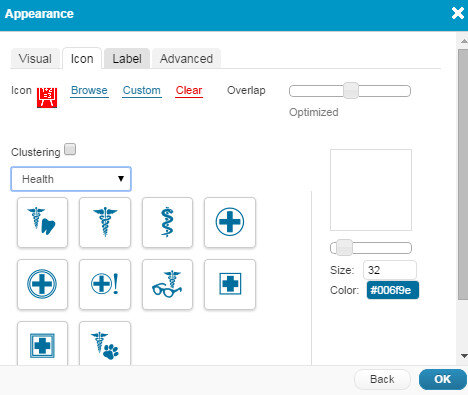 Map EditorHere you have a variety of tools available including those for data editing, feature selection, basic analysis, table joins, geocoding addresses. It even has a database manager. You can create new layers in your cloud account and edit them here. With the analysis tools you can compute areas, measure proximity of one feature to another, buffer a layer by a certain distance, and create density maps.
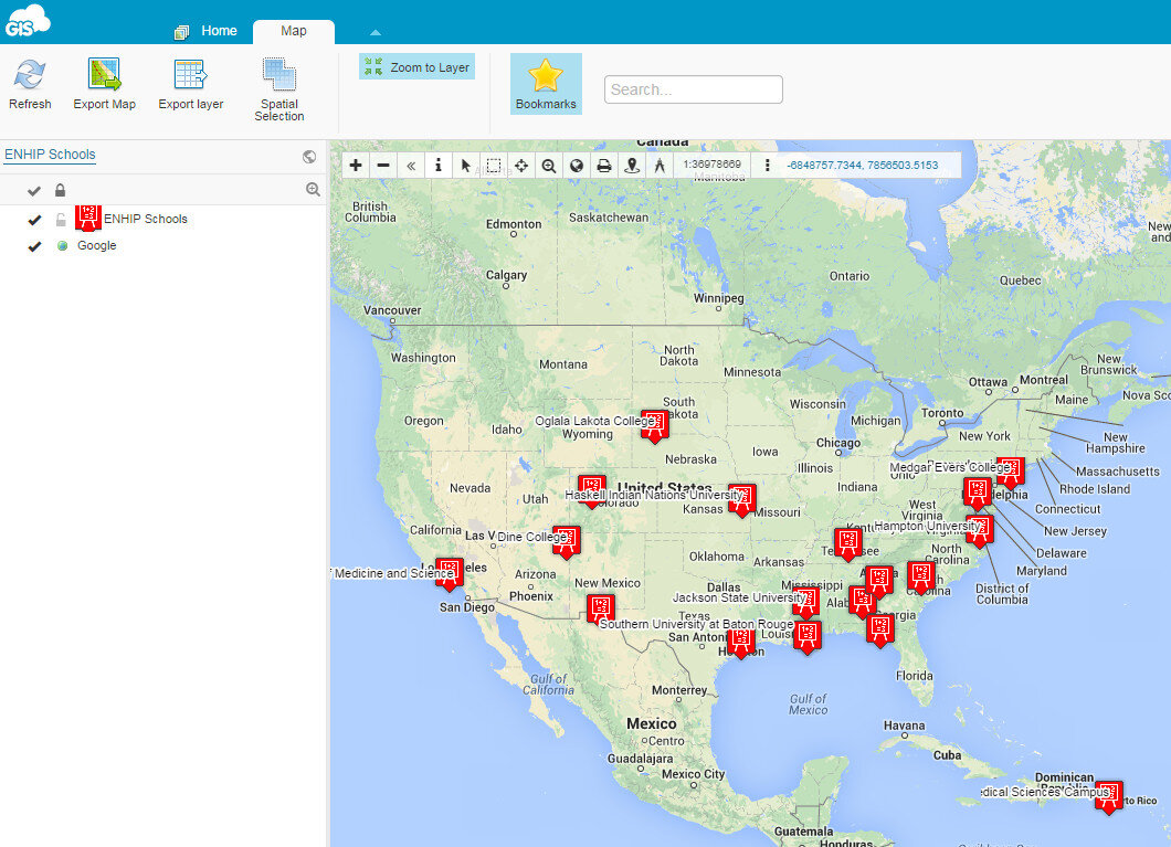
 Map ViewerHere your data can be viewed against basemaps such as Google and OpenStreetMap. Your map can also be shared and published. There are several ways to share your maps. The two easiest methods are to provide the link to your map, or embed the dynamic map in a web page. Clicking the Share and Publish button opens the window below. Here you are provided the url to your map viewer and the javascript for embedding the map into a webpage. I would have embedded a dynamic map here, however, WordPress does not allow bloggers to post JavaScript on WordPress.org blogs. You can also share your map with other GIS Cloud users by Publishing the map. Click on the image below to open up the ENHIP Schools in a GIS Cloud Map Viewer window.
 ResourcesOur Resources page has a GIS Cloud document that covers uploading data, styling data and sharing a map.There are additional online mapping platforms such as CartoDB and MangoMaps. We found GIS Cloud to be the best combination of being intuitive yet powerful. However, all three options have free licensing levels. So you can try them yourself and decide which works best for you. These other options will be covered in future posts. Happy mapping!
