It has been 2 years since the Community Health Maps (CHM) lab exercises were first produced. Software changes quickly, and over the last two years the tools involved in the CHM workflow have undergone many changes. For example, this fall the pricing scheme for iForm changed. Though it is still a good product, this price increase puts it out of the category of low cost software. The companion site formhub.org no longer exists, making ODK Collect more difficult to work with. Fortunately Fulcrum is a fantastic alternative to those two data collection apps. QGIS has released 5 new versions and is now at version 2.18! CartoDb has been rebranded as Carto and has a new interface. All these changes means it is time for all the lab exercises to be updated. Lab 1 will now be a single lab for both iOS and Android users with Fulcrum. Labs 2-5 will be updated to QGIS 2.18. Lab 6 will be updated to Carto's new interface. The set of companion videos will also be redone and updated.Many have worked through these labs and some provided feedback. This information is being used to improve the labs as they are updated. One new item will be Lab Zero. While the CHM workflow is intuitive, it has been suggested that more background information could be useful. Lab Zero will be a companion reference document to the CHM labs. It will contain: A) information on the background of the CHM project, B) software installation instructions , C) a glossary of terms, D) more thorough descriptions of some technical topics like coordinate reference systems, E) a description of how to interact with the QGIS community to get additional help, and F) a list of data resources. This work is in progress and will be ready this spring. Stay tuned!
Community Health Mapping: A New Year Review
To start the New Year I thought I’d begin with a review of Community Health Mapping (CHM). There are a lot of new project partners, and I thought it would be a good time to give a project overview. CHM is a collaborative effort between the National Library of Medicine, Center for Public Service Communications and Bird’s Eye View. The National Library of Medicine is funding the initiative.The overall goal is to empower community organizations serving vulnerable or underserved populations with low cost, intuitive mapping technology. Therefore we’ve been working with programs organizations who:
- Focus on vulnerable populations
- Frequently use and collect data
- Need effective, scalable & easy to use mapping tools
- Lack resources (i.e., for proprietary GIS training & software)
We have identified a suite of tools that allow you to collect custom field data, analyze that data, combine it with other spatial datasets, and generate both static maps and/or dynamic maps on the internet. This allows organizations to collect and work with their own data, and if appropriate, share it with others. CHM involves three components that meet all basic mapping needs:
- Field Data Collection
- Desktop Analysis and Cartography
- Internet Mapping
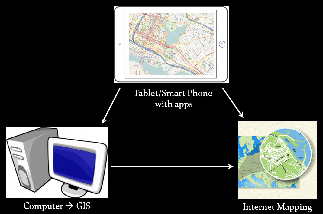 A given project may not require all three, however, collectively these components address the basic needs of all mapping projects.Field Data Collection:Rather than focusing on the use of expensive GPS receivers, we recommend the use of smart phones and tablets for these reasons:
- Most community-based organizations already have them!
- Many know how to use them
- They're intuitive
- They're portable
- They come with an on board GPS receiver (iPhone 5 uses GPS + GLONASS)
- Have on board cameras
- Can connect to wireless networks
- Access to the internet
- Email is available
- “There's an app for that!”
 Of course an important consideration is horizontal accuracy. You can read our blog post on that topic to see if mobile smart devices meet your project needs.When collecting data you need to be able to develop your own custom data collection form. The top three mobile apps we have found are:
- Fulcrum: Easiest to use - iOS & Android – low monthly subscription - http://www.fulcrumapp.com/
- iForm: Slightly steeper learning curve – iOS and Android – free account - https://www.iformbuilder.com/
- ODK Collect: Easy to use – Android only – free account - https://opendatakit.org/use/collect/
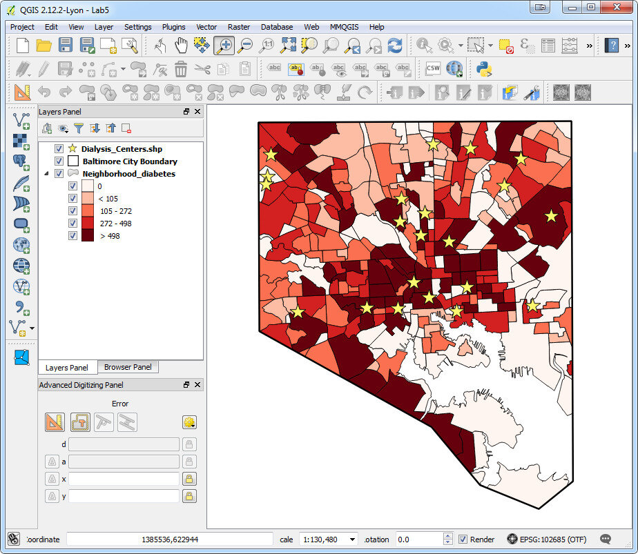
Desktop Analysis and Cartography:After community field data collection, the next step typically involves bringing the data into a desktop GIS. This is the middle step in the workflow. Here the data can be viewed against basemaps such as Google or OpenStreetMap, and combined with other organizational data. This is also where analyses (proximity, density etc.) can be conducted. Presentation quality maps can also be generated in this step.The software we found to be the best fit is QGIS. This is an open source desktop GIS software. It has many strengths:
- It can consume many kinds of data, including all the data that would come out of the field data collection apps.
- It is both intuitive and robust.
- It has a large suite of geoprocessing tools for analyzing data.
- It will run on Windows, Mac, or Linux.
- It is free to download and install.
- It is well documented.
- There is a large user community.
- New functionality is being continuously added. New stable versions are being released every 4 months!
 Web PresentationOften you may want to present an interactive map of your results. Interactive means the map reader can zoom in/out, pan the map and turn layers off and on. For this we recommend CartoDB.You can sign up for a free account, which gives you 50Mb of storage space. Data can be collected with a smart phone or tablet and brought directly into CartoDB. It is a very intuitive platform. You can literally drag and drop a spreadsheet onto the CartoDB page and have the data upload to your account. It will accept the most common geospatial file formats including: spreadsheets and comma delimited text files with addresses or coordinates, KML/KMZ, GPX, and shapefiles.CartoDB also has great documentation including:
- CartoDB Editor Documentation
- A comprehensive series of tutorials breaking tasks up into Basic, Medium and Advanced categories
- Tips and Tricks
- FAQ’s
 In ConclusionThis blog has a lot of resources including reviews of mapping technology and case studies. You might begin by clicking on some of the links in this entry. We are also working on a 6 lab CHM curriculum that interested parties will be able to use to hone their skills. Stay tuned for that!We are always looking for new partners and continuously work to support current project partners. If you are interested, or have questions please don't hesitate to contact John Scott (jscott at cpsc.com) or Kurt Menke (kurt at birdseyeviewgis.com). Most importantly get out and do some mapping in 2016!
Field Data Collection with Fulcrum
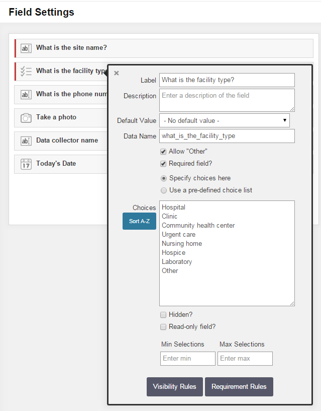
Fulcrum was reviewed in our initial survey of field data collection apps in 2012, and almost made the top three. In the last 3 years Fulcrum has improved and has become perhaps the most intuitive and useful data collection app we've evaluated period.It is available for both iOS and Android. It isn't free, but the subscription fee is affordable. It costs anywhere from $18 - $25 per month. The three pricing plans give you 10 - 30Gb of online storage, which is substantial. Fulcrum offers a free 30 day trial which includes all the functionality. You can use this option to test Fulcrum for your projects. In the following example, I will be using a health care facility data collection form to show how Fulcrum works.Fulcrum has the most intuitive data collection form builder of any app we've seen. When you design a form Fulcrum calls it an 'app'. Simply drag and drop from the Add Fields section to your 'app' to add questions (see figure below). Available data input types include text, numbers, date, single or multiple choice, photos, videos, and audio. There are no tricks to collecting GPS locations as with iForm. Fulcrum collects locations automatically.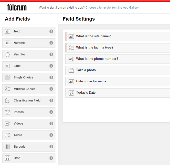 Once a field has been added simply set you parameters. The figure below shows the facility type question being edited. To do this simply click on a field, and fill out the details. It's so easy a 50 year old can do it!
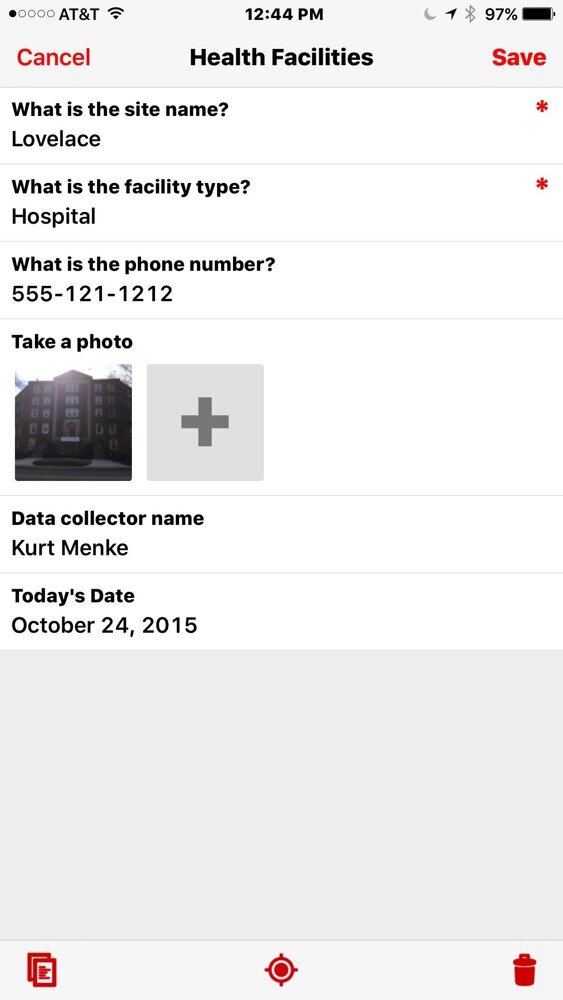
 The companion mobile app can be downloaded for free from the Apple Store or the Google Play Store. Once installed, login and your data collection app(s) will sync with your mobile device. The figure below shows the health care facilities data collection app on an iPhone. Answering the questions is intuitive. Once collected your data will be synced with your cloud account.
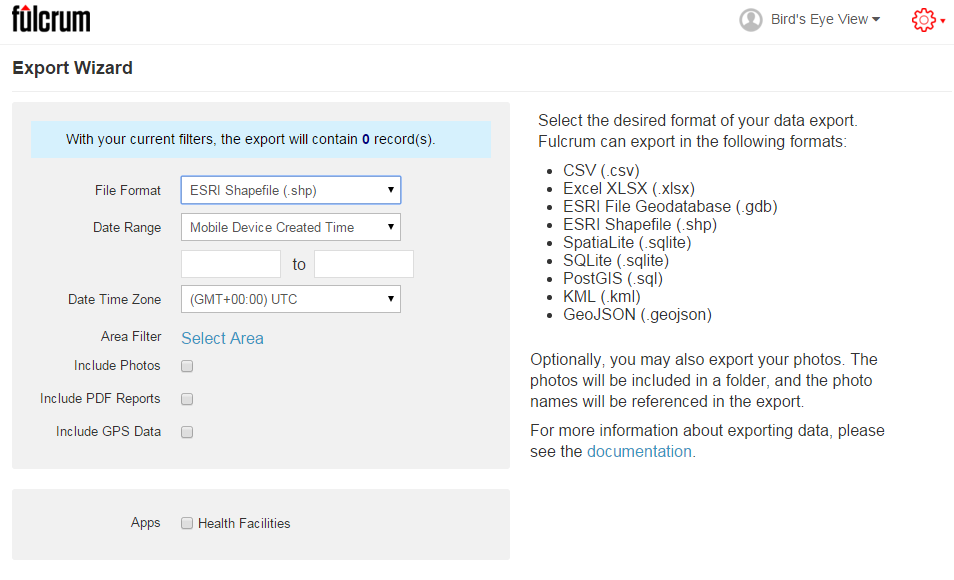
 Once back in the office, login to your account, select your data collection app, and choose Start Export Wizard. You will be taken to the page below. Choose your file format. A complete array of GIS formats is available including: shapefiles, geodatabases, KML, PostGIS and Spatialite. Choose any other appropriate options and click Next to download your data.
 I highly recommend that everyone involved in Community Health Mapping evaluate Fulcrum. Along with iForm and ODK Collect is a CHM recommended data collection tool. There is a monthly subscription fee but it is low. It is the easiest and most flexible tool we've found. You can use the free 30 day trial period to see if it works for you.
Field Data Collection with iForm
Unfortunately the most recent iOS system update rendered the EPI Collect app unusable. Apparently it is no longer being supported on the Apple platform. With this discovery, and a training in Charleston just around the corner, we set out to find a replacement. We searched for another free app for iPads and iPhones that allows you to develop your own data collection form. Fortunately we discovered iForm which turns out to be even easier to use, and more robust. (NOTE: It is also available for Android devices.) This app has a lot of similarities with ODK Collect which we recommend for Android users (ODK Collect is described in the Field Data Collection blog post). With iForm you create a free account on the companion iFormBuilder website. You use their online form builder to create your data collection form. The form builder has over 30 different types of data inputs to choose from! For example: text, number, date, time, pick list, phone number, location (GPS coordinates) and images (photographs). Individual data elements can be set up as questions for the data collectors such as: What is the name of the site?
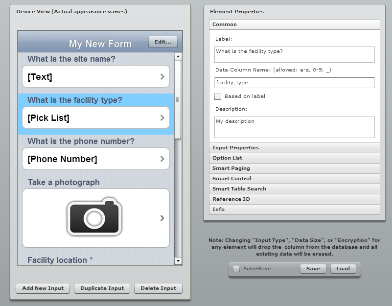 Once the form is developed you can begin to collect data.
- Open the app on your mobile device and login.
- Tap the Sync button and all the forms and records that are associated with your account will be downloaded to the device.
- Head out to your project site and collect data.
- At the first data collection site simply open the data collection form, answer each question, and click Done to save the information.
- Repeat at each site.
 If you are collecting data while in cellular coverage, the data will be synced to your iFormBuilder cloud account as you go. If you leave cellular coverage that is OK. The on-board GPS receiver on your mobile device will still allow you to collect your locations. Once you are back within cellular range you can Sync your data to your iFormBuilder cloud account. The data can be viewed on the mobile device in tabular or map format. Back in the office the data can be downloaded from the iFormBuilder site in several formats, the most useful of being an Excel spreadsheet. The data in the spreadsheet can then be brought in QGIS or CartoDB and mapped.
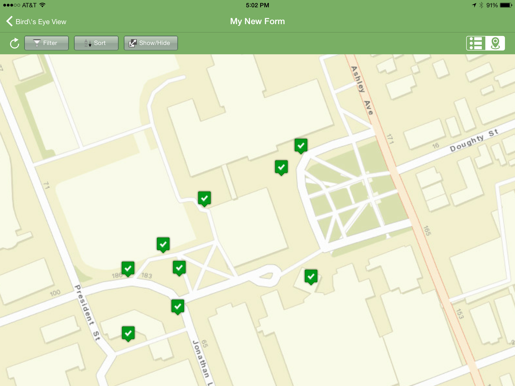 iForm has some additional features that stream line data collection. You can link your iFormBuilder account to a DropBox or Box account. With this link established your data and photos will be uploaded to a DropBox folder automatically. There are also tools for assigning a form to different users. This allows you to develop one data collection form and share that among a team of data collectors.The free iFormBuilder account has some limits. You are limited to 10 forms and 100 records per form. However, you can log in to your account, export the data, and delete those online records and continue data collection.In summary, iForm is a powerful and intuitive free app for collecting community health data with iPhones, iPad, and Android devices.
Community Health Maps Conducts a Training in the South Carolina Lowcountry
Recently Kurt Menke headed to Charleston, South Carolina to train several groups how to map their communities. This region is also known as the 'lowcountry' due to the flat, low elevation geography. The training was hosted by the Medical University of South Carolina (MUSC) and included people from Communities in Schools - Charleston (CISC) and the MUSC College of Nursing.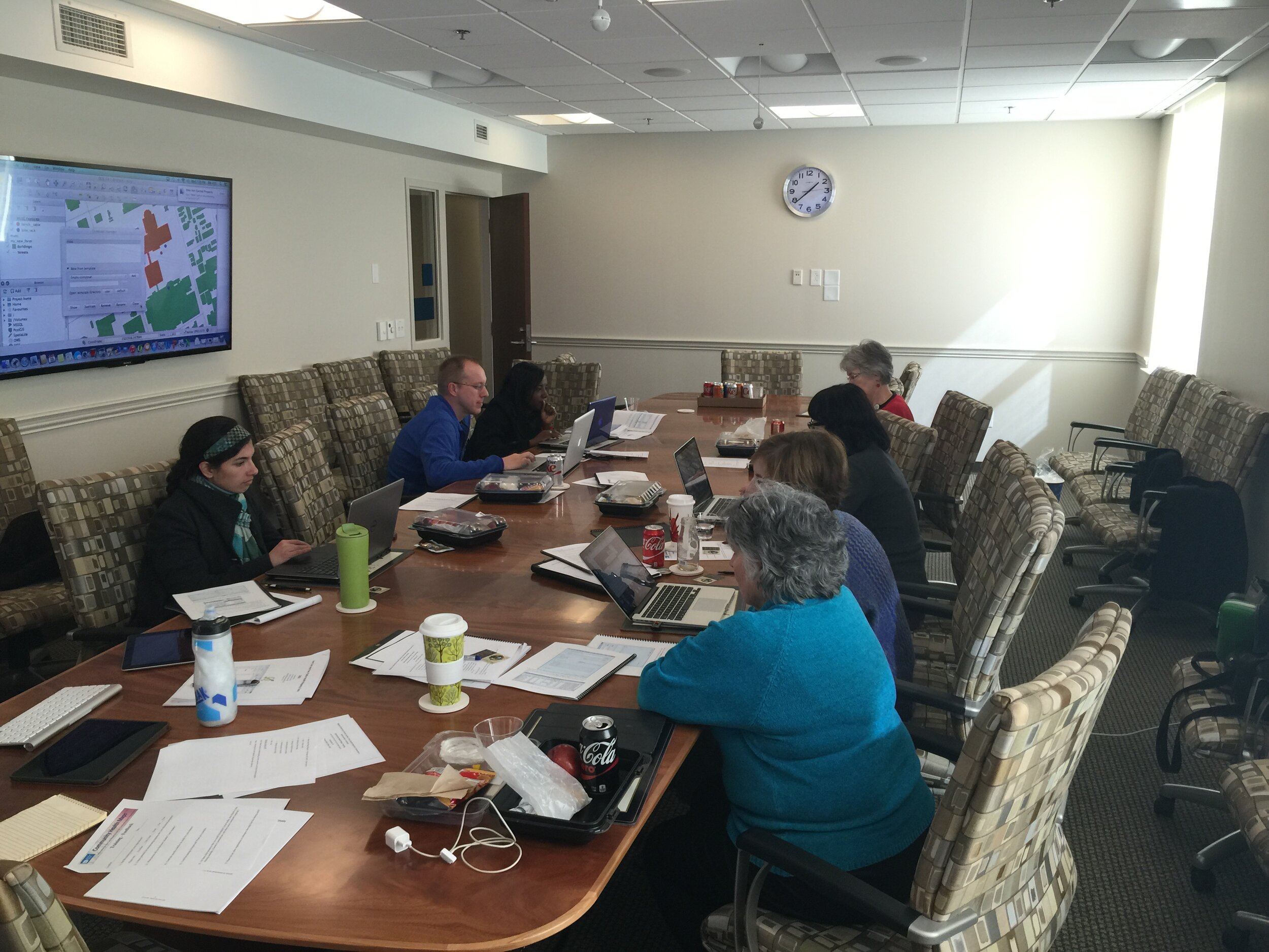 First everyone learned how collect GPS field data with iPads. For this we used a new app named iForm. This app was used in lieu of EPI Collect, which no longer supported on iOS. (The next blog post will cover iForm in more detail.) iForm is an app very similar to the Android app ODK Collect, allowing a custom data collection form to be developed. To practice we collected bike rack locations and seating areas around the MUSC campus. The afternoon was spent working with everyone's data. GPS data points were brought into QGIS and shown against some local Charleston GIS data layers.
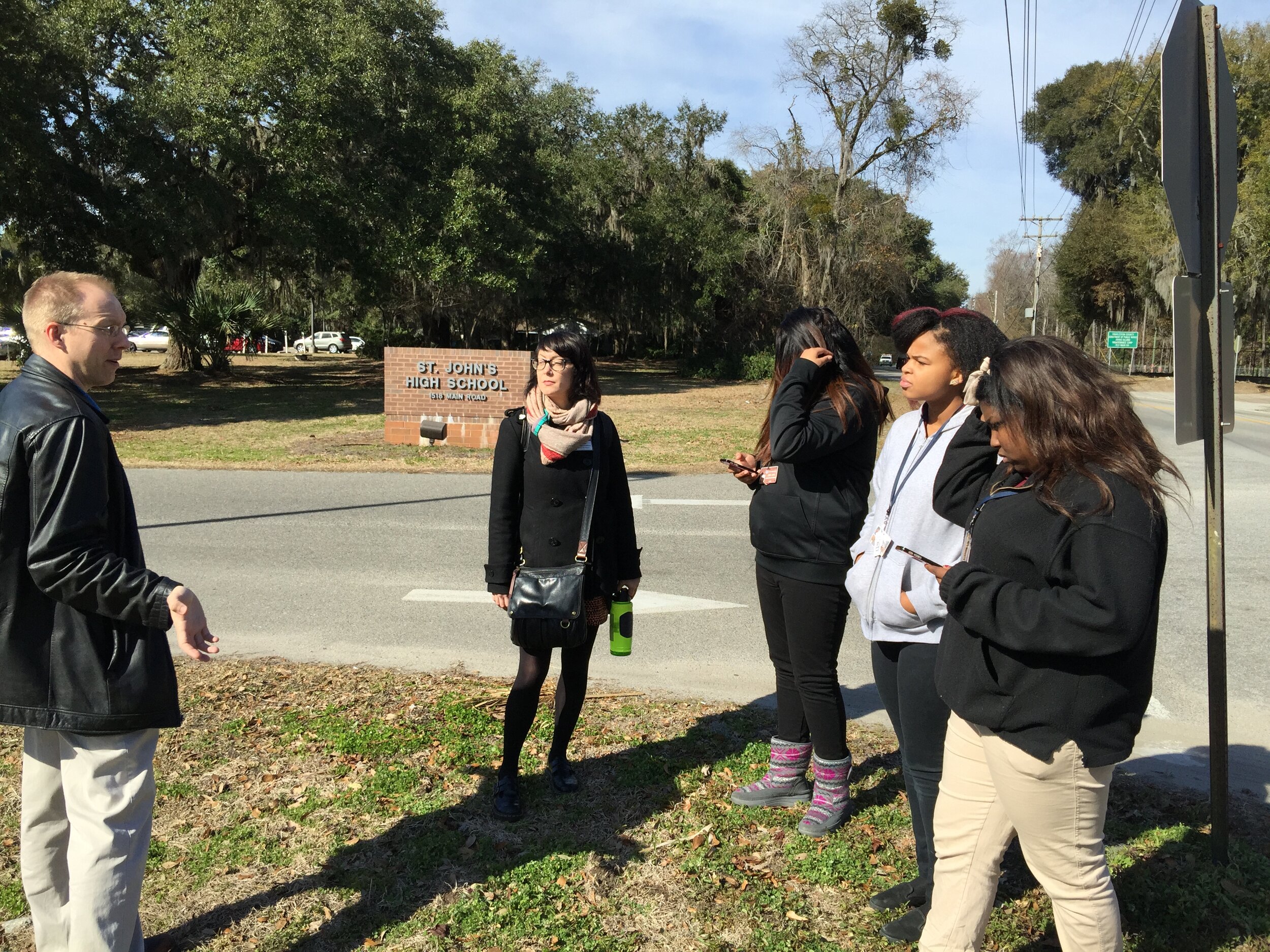
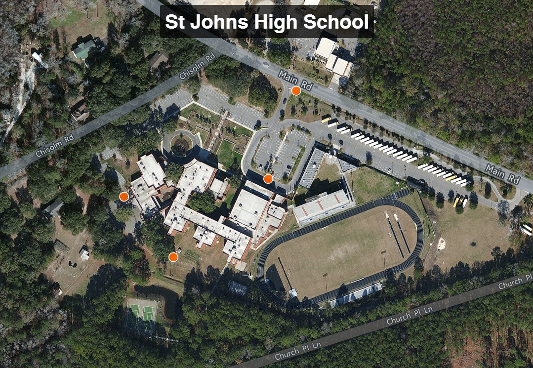
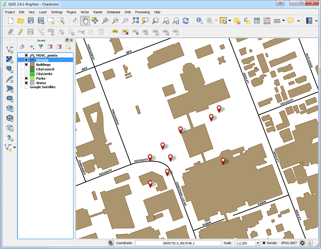 The points were also uploaded to CartoDB. CartoDB is another new component of the Community Health Mapping workflow. It has become more intuitive than GIS Cloud and worked really well. (Note: There will be a post on using CartoDB soon too.)The following day I visited CISC's Derek Toth and three of his students at St. John's High School on John's Island, SC. Over a working lunch Mr. Toth showed students how easy it is to collect GPS points with their iPhones. We collecting several points while walking around the campus.
 Afterwards we went back inside and showed them how to upload the points into CartoDB and make a map. The figure below shows the results of 45 minutes worth of work! Click on the map to open the live version.
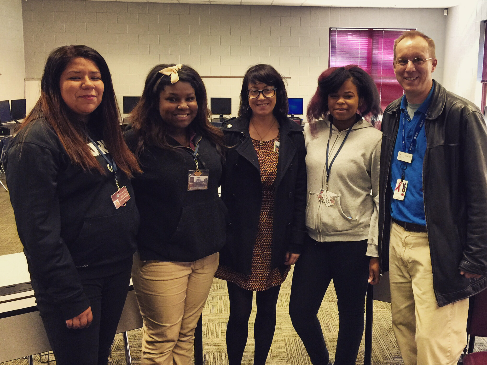
 This spring these three juniors will be leading the charge to map their island! They will be presenting their work to the National Library of Medicine later this spring. I look forward to seeing their work!
Noise Pollution and Health in the Urban Environment: A Pilot Project
In October 2013, the Seattle Indian Health Board’s (SIHB’s) Urban Indian Health Institute (UIHI) completed a noise pollution pilot study. The goals of this project were: 1) to evaluate the feasibility of community data collection and analysis via a low cost GPS/GIS workflow, and 2) to offer recommendations on the feasibility and next steps for scalability to the larger Urban Indian Health Organization (UIHO) network. The collected data could additionally illustrate community health needs when merged with health or other contextual data for analysis, but these analyses were not the primary focus of this pilot. We chose to look at noise pollution because it is an environmental health concern that has been linked to a variety of health conditions in both occupational and community studies and it is easy to measure with portable devices.For field data collection, we used an iPad Mini with the GISPro and Decibel 10th apps. For mapping and spatial analysis, we used the open source desktop GIS software QGIS (www.qgis.org). While GISPro is a paid iPad app, the other programs are free. Data collection participants were staff recruited from the SIHB’s administrative, clinical and UIHI departments. We selected participants from this pool because they are representative of the staff at UIHOs who likely have limited experience with data collection and GIS. UIHI project staff trained seven participants in the iPad workflow and data collection process. This workflow consisted of five steps: 1) collect noise data with Decibel 10th, 2) export noise data via email, 3) take a site picture, 4) collect GIS data with GISPro and 5) export that GIS data. When the volunteer participants were finished with data collection, project staff compiled and analyzed the data using QGIS and Stata. Data were merged with socioeconomic indicators from the American Community Survey by zip code. Participating staff were asked for their feedback about their experience and the usability of the tools.
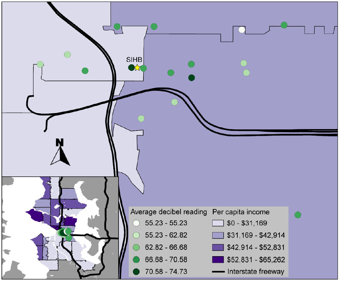 That feedback, combined with the experience of project staff, suggested that the GIS software tools were user-friendly and highly effective. Thus, they are likely to be attractive to organizations with limited technology budgets. However, some of the other resources necessary for this project (i.e. the GISPro mapping app, the iPad and general GIS software expertise) are expensive and may be limitations for many UIHOs. In the future, the UIHI would like to use these tools to better understand the health of the community, as well as assist UIHOs in conducting similar projects in their service area.For more information about this project, view the project brief at http://www.uihi.org/wp-content/uploads/2014/08/GIS-Project-Brief_20140604.pdf.The UIHI is a division of the SIHB and is one of 12 Indian Health Service tribal epidemiology centers (TECs). Unlike the other TECs that focus on geography-specific tribal populations, the UIHI is national in scope, focusing on American Indians and Alaska Natives (AI/ANs) living in urban areas. The UIHI supports the efforts of Urban Indian Health Organizations (UIHOs) nationally, as they serve the health and social support needs of their urban AI/AN communities.The Center for Public Service Communications and the National Library of Medicine provided funding for the UIHI to complete this project.
